When Averages Run Wild: The Limits of the Central Limit Theorem
I had so much fun creating this post on sampling distributions last week that I decided to do another post that uses simulations in R to illustrate core statistical concepts. This time I thought I’d focus on the central limit theorem.
The central limit theorem is another one of those concepts taught in introductory stats courses. The theorem states that when you take the average of a large enough pool of independent samples from any distribution (with finite variance), that average will follow a normal distribution, regardless of what the original distribution looked like. This is extremely useful for conducting inferential statistics because it means that even if you’re sampling from a wildly skewed or unusual distribution, the sampling distribution of the mean will eventually converge to a normal distribution.
To illustrate, I generated sampling distributions for three different types of non-normal distributions: a uniform distribution, a skewed one, and a bimodal one. For each sample size (shown as rows in the figure below), I simulated 100,000 samples, for each one taking the mean. The panels in the figure below show the distribution of the sample mean across the 100,000 simulations. The top row in the figure shows the sample mean for a sample size of 1. This is just equivalent to the probability density function of the distribution itself (since the mean of any single value is just the value itself). So, as we’d expect, the shape of the distributions are still highly non-normal.
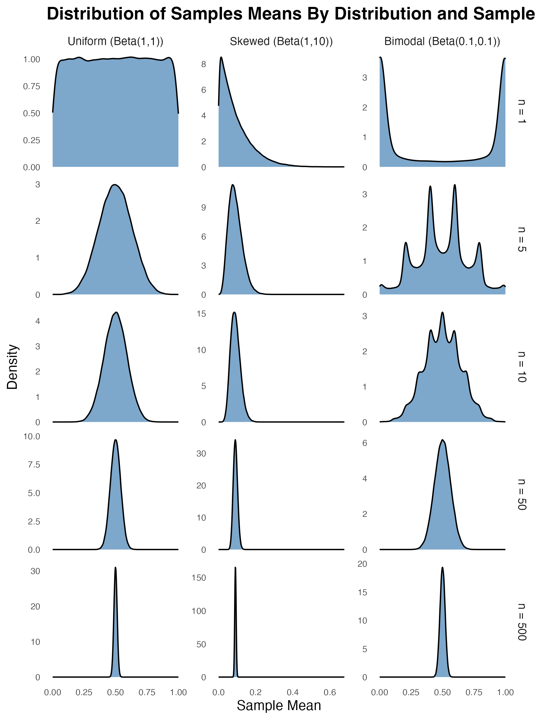
However, as the sample size increases (as you move down the rows), all three distributions eventually start to look like the classic bell curve (albeit quite skinny or concentrated ones by the time you get to a sample size of 500). This is the central limit theorem at work. As you take the average across larger and larger samples, the sample mean will converge toward normality regardless (well, almost regardless) of the underlying distribution that generated each value within the sample.
When Does the Central Limit Theorem Fail?
It’s at this point that most introductory stats courses stop. But as it turns out, there are limits to the central limit theorem. I alluded to one of the main assumptions of the theorem at the top of the post–the assumption that the variance of the underlying distribution must be finite. If this assumption isn’t met, the theorem doesn’t hold.
So what does it mean for a distribution to have finite variance? In simple terms, it means that the variance is a specific, calculable number. Let’s consider a normal distribution as an example. If you repeatedly generate 1 million random values from a standard normal distribution and take the variance each time, your result will always be almost exactly 1. For example, I’ve just run var(rnorm(1e6)) 10 times and got the following results: 1.002523, 1.000306, 0.9988206, 1.000069, 1.000434, 0.9999488, 1.000751, 1.001484, 1.000737, 0.9995434. And the more values you generate, the closer your computed variance will be to one. So the variance of a normal distribution converges to a single value.
This is not true for all distributions. A classic example is the cauchy distribution, which is a special case of Student’s t distribution with only one degree of freedom. The left panel of the figure below shows the probability density function of the Cauchy distribution. At first glance, it looks deceptively like a normal distribution. It has a bell-like shape with a peak in the middle, but its tails are much “heavier” than a normal distribution, which means that extreme values occur far more frequently. In fact, these values are so extreme and so frequent that they prevent the variance estimate from stabilising. To illustrate, here are the results returned when I run var(rcauchy(1000000)) 10 times: 1302851, 21687560, 3554555, 1306802, 3552145, 1078193, 76092406, 6515833, 562154.3, 739489.5. That’s more than 2 orders of magnitude of inconsistency. And it’s not the case increasing sample size fixes things. In fact, as the number of values per sample approaches infinity, the estimated variance doesn’t converge to any value. It continues to fluctuate wildly and can grow without bound.
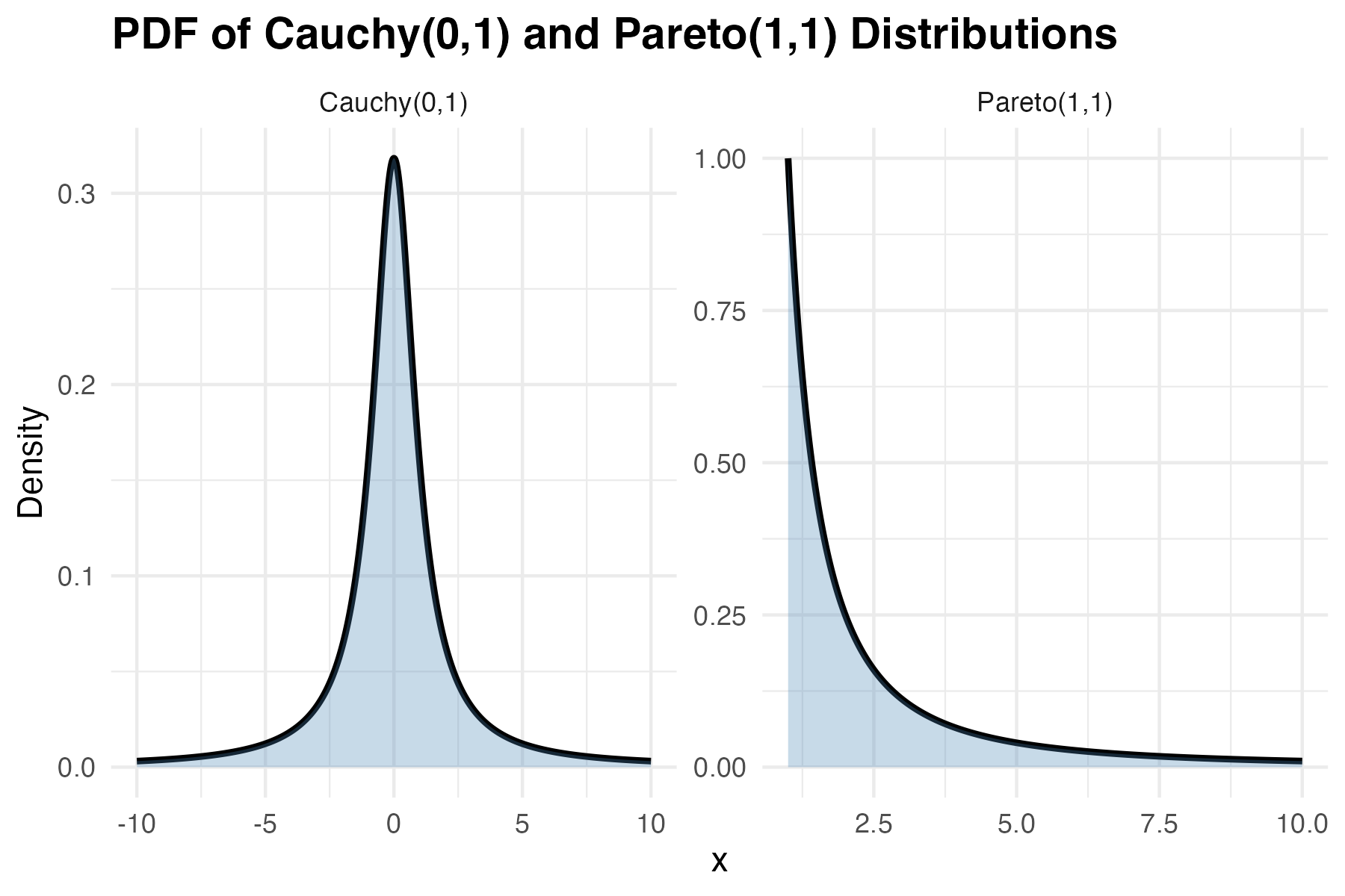
The Pareto distribution also has non-finite variance under certain circumstances (specifically, when its shape parameter is less than 2). This distribution, like the Cauchy distribution, allocates non-trivial density to extremely high values. This makes the Pareto distribution particularly relevant for modeling real-world phenomena with extreme outliers, such as wealth distributions, city sizes, and earthquake magnitudes. But it also makes the distribution tricky to work with.
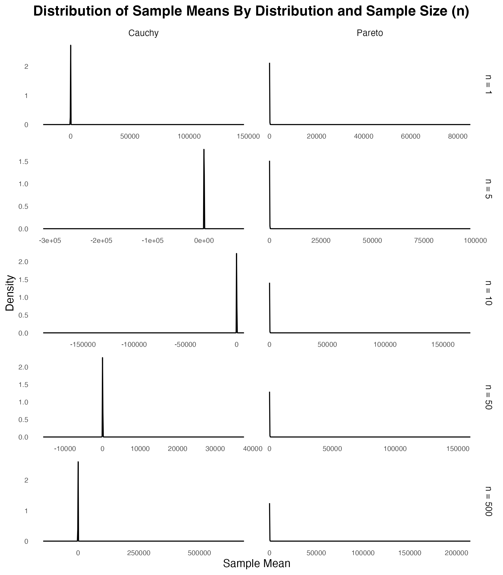
So why doesn’t the central limit theorem apply in these cases? Take a look at the figure below and see what happens to the distribution of the sample mean as the sample size increases. As can be seen, even when n = 1, there’s something weird going on. The panels in the top row show that while there’s a spike in density at the modal value of 0, there are some extreme outliers. While the outliers themselves aren’t visible in the plots, you can see their presence because they stretch the range of the x-axis. As you move down through the rows, you can see that increasing the sample size doesn’t get rid of this outlier problem. No matter how large the sample, these distributions never converge to normality.
So…Who Cares?
So apart from being interesting to stats nerds like me, why does this matter? How often do real-world phenomena follow Cauchy or heavy-tailed Pareto distributions? They’re actually not that rare. Financial returns, especially during market crashes, can exhibit extreme outliers that make variance calculations unstable. Network latencies in distributed systems can have heavy tails due to occasional catastrophic delays. Even insurance claims can follow heavy-tailed distributions where a few massive payouts dwarf all others. In these situations, blindly applying statistical methods that assume the central limit theorem holds (e.g., using standard confidence intervals or t-tests) can lead to inaccurate conclusions. So when your data might contain extreme outliers, it’s worth checking whether those outliers are just rare events from a well-behaved distribution, or signs that you’re dealing with a heavy-tailed monster where traditional statistics break down.
This post was inspired by this video from my favourite maths youtuber (everyone has a favourite maths youtuber, right?).
R code used for these simulations
# Clear workspace
rm(list=ls())

# Load packages
library(tidyverse)
library(ggh4x)
library(EnvStats)

# Set seed for reproducibility
set.seed(123)

# Set plotting theme
theme_set(theme_minimal() + theme(panel.grid.major = element_blank(), panel.grid.minor = element_blank()))

# Number of simulations
n_sims <- 100000

#===============================================================================
# PART 1: CENTRAL LIMIT THEOREM DEMONSTRATION
#===============================================================================

# Generate data for all distributions and sample sizes
ctr=0
clt_data_list = list()
for(n in c(1, 5, 10, 50, 500)){

  ctr=ctr+1

  # Simulate n samples from a Bernoulli distribution with p = 0.5
  means = rowMeans(matrix(rbeta(n*n_sims,1,1),nrow=n_sims,ncol=n))
  tmp1 = tibble(means = means, n = n, dist_type = "uniform")

  # Simulate n samples from a Uniform distribution
  means = rowMeans(matrix(rbeta(n*n_sims,1,10),nrow=n_sims,ncol=n))
  tmp2 = tibble(means = means, n = n, dist_type = "skewed")

  # Simulate n samples from a Non-uniform distribution
  means = rowMeans(matrix(rbeta(n*n_sims,0.1,0.1),nrow=n_sims,ncol=n))
  tmp3 = tibble(means = means, n = n, dist_type = "bimodal")

  clt_data_list[[ctr]] = bind_rows(tmp1,tmp2,tmp3)

}

# Combine all data frames into one
clt_data = bind_rows(clt_data_list)

# Create CLT demonstration plot
p1 <- clt_data %>%
  mutate(
    dist_label = factor(dist_type, levels = c("uniform", "skewed", "bimodal"),
    labels=c("Uniform (Beta(1,1))", "Skewed (Beta(1,10))", "Bimodal (Beta(0.1,0.1))")),
    n_label = factor(n, levels = c(1, 5, 10, 50, 500),
    labels=c("n = 1", "n = 5", "n = 10", "n = 50", "n = 500"))
  ) %>%
  ggplot(aes(x = means)) +
  geom_density(fill = "steelblue", alpha = 0.7) +
  ggh4x::facet_grid2(n_label ~ dist_label, scales = "free", independent = "y") +
  labs(
    title = "Distribution of Sample Means By Distribution and Sample Size (n)",
    x = "Sample Mean",
    y = "Density"
  ) +
  theme(
    strip.text = element_text(size = 9),
    axis.text = element_text(size = 7),
    plot.title = element_text(size = 14, face = "bold"),
    plot.subtitle = element_text(size = 11)
  )

#===============================================================================
# PART 2: CENTRAL LIMIT THEOREM DEMONSTRATION - INFINITE VARIANCE
#===============================================================================

# Plot the PDF of Cauchy(0,1) and Pareto(1,1) distributions

# Create a data frame for Cauchy(0,1)
x_cauchy = seq(-10, 10, length.out = 1000)
df_cauchy = tibble(
  x = x_cauchy,
  density = dcauchy(x_cauchy, location = 0, scale = 1),
  dist = "Cauchy(0,1)"
)

# Create a data frame for Pareto(1,1)
x_pareto = seq(1, 10, length.out = 1000)
dpareto = function(x, location = 1, shape = 1) {
  ifelse(x >= location, shape * location^shape / x^(shape + 1), 0)
}
df_pareto = tibble(
  x = x_pareto,
  density = dpareto(x_pareto, location = 1, shape = 1),
  dist = "Pareto(1,1)"
)

# Combine data frames
df_pdf = bind_rows(df_cauchy, df_pareto)

# Plot
pdf_plot = ggplot(df_pdf, aes(x = x, y = density)) +
  geom_line(size = 1) +
  geom_ribbon(aes(ymin = 0, ymax = density), fill = "steelblue", alpha = 0.3) +
  facet_wrap(~dist, nrow = 1, scales = "free") +
  labs(
    title = "PDF of Cauchy(0,1) and Pareto(1,1) Distributions",
    x = "x",
    y = "Density",
    color = "Distribution"
  ) +
  theme_minimal() +
  theme(
    plot.title = element_text(size = 14, face = "bold"),
    legend.title = element_text(size = 10),
    legend.text = element_text(size = 9)
  )

# Generate data for both distributions and all sample sizes
ctr=0
clt_data_list2 = list()
for(n in c(1, 5, 10, 50, 500)){

  ctr=ctr+1

  # Simulate n samples from a Bernoulli distribution with p = 0.5
  means = rowMeans(matrix(rcauchy(n*n_sims,location=0,scale=1),nrow=n_sims,ncol=n))
  tmp1= tibble(means = means, n = n, dist_type = "cauchy")

  # Simulate n samples from a Uniform distribution
  means = rowMeans(matrix(rpareto(n*n_sims,location=1,shape=1),nrow=n_sims,ncol=n))
  tmp2 = tibble(means = means, n = n, dist_type = "pareto")

  clt_data_list2[[ctr]] = bind_rows(tmp1,tmp2)

}

# Combine all data frames into one
clt_data2 = bind_rows(clt_data_list2)

# Create second CLT demonstration plot
p2 <- clt_data2 %>%
  mutate(
    dist_label = factor(dist_type, levels = c("cauchy", "pareto"),
    labels=c("Cauchy", "Pareto")),
    n_label = factor(n, levels = c(1, 5, 10, 50, 500),
    labels=c("n = 1", "n = 5", "n = 10", "n = 50", "n = 500"))
  ) %>%
  ggplot(aes(x = means)) +
  geom_density(fill = "steelblue", alpha = 0.7) +
  ggh4x::facet_grid2(n_label ~ dist_label, scales = "free", independent = "x") +
  labs(
    title = "Distribution of Sample Means By Distribution and Sample Size (n)",
    x = "Sample Mean",
    y = "Density"
  ) +
  theme(
    strip.text = element_text(size = 9),
    axis.text = element_text(size = 7),
    plot.title = element_text(size = 14, face = "bold"),
    plot.subtitle = element_text(size = 11)
  )